Chris Bingham from Cyan Bold Design
The Masters of Design (MDes) program got a new look this spring. MDes Director, Megan Smith, and Communications Strategist, Shauna Oddleifson, worked with local designer Chris Bingham from Cyan Bold Design to create a new visual identity for the program.
Chris Bingham, CDPTM, is the graphic designer responsible for Cyan Bold Design in Kelowna, BC. He started his career in design as an educator, then moved on to agency work and in-house design before establishing his own gig. Specializing in brand identity and logo design, he has worked with clients across various industries, from school divisions to social enterprises and machinery to marmalade. However, nothing pleases him more than being able to break out all of the colours in the crayon box and use them in a design project.
Beyond design, Chris works as a brand strategist and consultant, a role that involves bridging the gap between marketing and design. As a brand strategist, he helps his clients define their brand’s unique value proposition, target audience, and competitive positioning. He then advises them on how to express these elements through their brand assets, such as campaign materials, stationery, social media, packaging, stage scrims, tradeshow materials, banners, billboards, print ads, online ads, brochures, signage, stickers, apparel, swag, posters, and more.
Chris firmly believes in the transformative power of graphic design to shape perceptions and unite communities. He has demonstrated this belief through initiatives like Design Day for GOOD, which he organized to amplify the visual presence of nonprofit organizations in Kelowna. His collaboration with You Are Collective on Pride apparel collections supporting Etcetera Youth Group is another testament to his commitment to using design for positive change.
His motto is to BE BOLDER BY DESIGN, and he puts that to work in everything he does.
“One of the goals of the MDes is to build partnerships in the community, and working directly with the design community in Kelowna was a great way for us to start to make those connections,” explains Megan Smith. “Working with Chris to come up with this new look and feel for our program really helps to synthetize our messaging, and we are thrilled with the work that was done.”
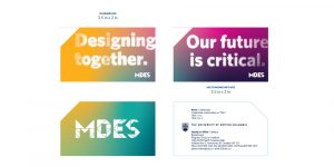
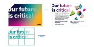
This new visual identity can be seen throughout this web site, in our digital marketing, and will soon show up on new tote bags, t-shirts and other items for giveaways.
Here are some examples of the design elements used in creating the assets for the program marketing:
Transformative data visualizations


Business card and postcard Designs


Comments are closed, but trackbacks and pingbacks are open.